Why Grid Systems Still Matter
Grids are the silent framework behind every polished design. Without them, layouts feel scattered, imbalanced, and harder to follow. With them, things just make sense text aligns, visuals breathe, and the whole piece communicates with more clarity.
In 2024, consistency is more than a nice to have. With users jumping between phones, tablets, laptops, and giant monitors, a design has to look solid at every screen size. A properly built grid system gives you that backbone. It makes sure your spacing holds up, your columns flex the right way, and your message doesn’t fall apart just because the screen got smaller.
The best part? You don’t have to sacrifice creativity. Grids guide structure they don’t dictate style. Think of them more like invisible tracks. They help you control rhythm and flow, while still letting you push elements where they need to go. You can break the rules when it counts, but grids make sure you know exactly what you’re breaking and why.
Want to dig deeper? Check out this full guide to grid systems in design.
Key Grid Types You Should Know
Understanding the different types of grid systems is essential for building consistent, flexible, and scalable designs. Each grid type serves a unique purpose, and knowing when to use which can elevate your work across platforms.
Baseline Grids vs. Column Grids
While both baseline and column grids provide structure, they serve very different roles:
Baseline Grids
Focus on vertical rhythm and text alignment
Ideal for ensuring consistent spacing across body text, headlines, and UI elements
Commonly used in text heavy interfaces and editorial layouts
Column Grids
Organize content horizontally into defined sections
Help balance layout across multiple visual elements like text, images, and buttons
Widely used in responsive websites and modern UI design
Tip: Combine both! Use a baseline grid for vertical consistency and layer on a column grid for horizontal alignment.
Modular Grids: Pros, Cons, and Use Cases
What Are Modular Grids?
Modular grids break the space into both rows and columns, creating a matrix of content blocks. They’re like a combination of a column and baseline grid with enhanced flexibility.
Pros
Great for complex interfaces or dashboards
Allow for reusable content blocks and highly organized pages
Facilitate easy content reordering
Cons
Can become rigid if overused
More time consuming to set up and maintain
Best For
Data heavy interfaces
Portfolios, design systems, and layout intensive projects
Choosing the Right Grid by Platform
Your platform determines your grid strategy. Here’s a quick guide:
Web
Responsive column grids are king (12 column is most common)
Use flexible gutters and fluid widths for adaptability
Print
Fixed, exact measurements; consider margins and bleeds
Use baseline grids heavily for precise text placement
Mobile
Simpler grid systems (usually 4 6 columns)
Prioritize readability and tap targets over strict alignment
Choosing the right grid system isn’t about following rules it’s about creating a solid foundation that serves your content and users. Let your content determine your layout structure, and modify your grid to suit the medium, not the other way around.
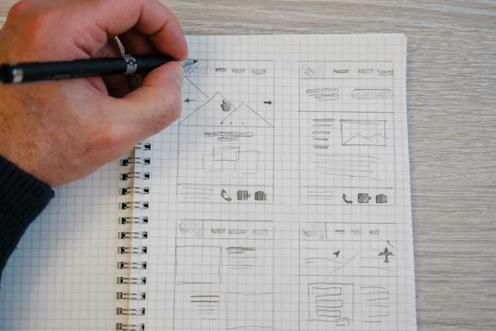
How to Build a Strong Grid from Scratch

Start simple: define your margins. Margins set the breathing room for your content, and they anchor the rest of your layout. Depending on the platform mobile, web, or print margin size may vary, but aim for balance and whitespace that supports the content without overwhelming it.
Next comes the column setup. Columns are your layout’s skeleton. A 12 column grid is common for web because it’s flexible, but your needs might call for fewer or more. Keep column widths consistent and space them out with gutters those invisible slices between columns. Gutters make sure your content doesn’t feel crammed and help maintain visual clarity.
Now, step back and think rhythm. Vertical rhythm, that is. Spacing between rows should follow a consistent pattern, usually aligned with a baseline grid. It creates flow and cohesion from top to bottom.
Once your grid is in place, it’s time to test it. Zoom out. Scrub your layout top to bottom. Look for misaligned edges, inconsistent spacing, or strange gaps that break your rhythm. Set up rulers and frames in your tool of choice to make this part easier, not harder.
Speaking of tools, don’t just eyeball it. Use what’s built in. Figma’s layout grids, Adobe XD’s guides, or Sketch’s snapping features are there to keep your structure honest. Turn layout overlays on and off to check alignment. Use measurement tools to verify spacing. And don’t skip the preview what looks centered in edit mode can drift when you test live.
Building a grid is part math, part instinct. But once you dial it in, everything else starts falling into place.
Making the Grid Work Without Looking Trapped
Grids create order but too much order can flatten personality. You don’t want layouts that feel like someone filled out a spreadsheet. That’s where rule breaking comes in strategically, not sloppily. The key is knowing the rules well enough to bend them without breaking the experience. When done right, stepping outside the grid brings emphasis, flow, and a little humanity back into a layout.
Break the grid when it serves a purpose. Want to pull eyes toward a key piece of content? Let it bleed outside the column lines. Need to build contrast or hierarchy? Shift an image off center or introduce unexpected white space. But keep one hand on the structure it should still feel intentional, not chaotic.
Spotify’s campaign landing pages often stretch typography or visuals across multiple columns, dropping symmetry for emotional impact. Apple breaks alignments frequently in product pages to slow the scroll and focus attention. In both cases, the design still feels balanced because the broken parts ride on top of a strong system. They’re not ditching the grid. They’re using it as a base to disrupt in a good way.
Grid Consistency Across a Design System
Good design systems don’t just make things look good they make teams faster and products more reliable. To do that, your grid has to work both at the macro and micro levels. Designing for full screens is one thing hero sections, responsive layouts, column widths. But components are where things really get tested. Cards, buttons, modals, and dropdowns need to plug into the larger system without breaking rhythm. That’s where consistency either lives or dies.
This is where global spacing rules pay off. When margins, paddings, and gutters are standardized, designers spend less time debating pixels and more time solving real problems. Developers love this too. A cleaner handoff means fewer design tickets, less back and forth, and fewer surprises in staging.
Scaling a product fast? Then keeping visual rhythm alive isn’t optional. It’s what keeps your system from turning into visual spaghetti. Use modular grids, spacing tokens, and preview at multiple breakpoints early. Grid consistency isn’t rigid it’s rhythm. And when everyone’s designing to the same beat, things just flow.
Want to go deeper? Check out this full take on grid systems in design
Creating Repeatable Design Success
Design consistency isn’t just a nice to have it’s how brands become recognizable at first glance. When layouts feel familiar across screens and formats, users trust what they’re seeing. That trust turns into longer engagement, better recall, and eventually, brand loyalty.
Enter grid systems. A strong grid eliminates the guesswork from layout decisions. Once your spacing, rhythm, and alignment rules are dialed in, every new screen or page becomes less of a creative mess and more of a clean execution. That doesn’t just save time it also cuts down on back and forth with stakeholders who wonder why one element’s floating an inch left for no clear reason.
Fewer design decisions mean fewer mistakes, faster turnarounds, and more energy spent where it matters on content and functionality. A solid grid gives teams room to move fast, stay sharp, and deliver designs that don’t just look right but feel right.