Have you ever wondered how top designers achieve that polished and consistent look in their work? Grid systems might just be the secret ingredient. In my experience, utilizing grid systems is a game-changer when it comes to design consistency. By aligning elements to a set grid, I’ve found that my designs not only look more professional but also flow seamlessly across different mediums.
In this article, I’ll delve into the world of grid systems and how they can elevate your design game. From creating balanced layouts to ensuring a harmonious visual hierarchy, grid systems offer a structured approach that can transform your design process. Join me as we explore the power of grid systems in achieving design perfection.
Understanding Grid Systems in Design
Exploring grid systems is key to achieving a polished and consistent design. Aligning elements to a defined grid enhances consistency, professionalism, and flow across various mediums. Grid systems elevate design outcomes by fostering balanced layouts and maintaining a harmonious visual hierarchy.
Benefits of Using Grid Systems
When it comes to design, using grid systems offers several advantages. Let’s dive into how incorporating grid systems can benefit your design projects:
Enhancing Design Consistency
Grid systems play a vital role in enhancing design consistency. By aligning elements to a predefined grid structure, I ensure that my designs have a cohesive and unified look. Consistency in spacing, alignment, and proportions make the overall design more visually appealing and polished.
Streamlining Layout Design
Another significant benefit of using grid systems is that they streamline layout design. When I adhere to a grid system, I find it easier to organize content and design elements efficiently. Grids help me create a clear visual hierarchy, making it simpler for users to navigate through the design. Additionally, grid systems speed up the design process by providing a framework that guides the placement of elements, resulting in a more organized and structured layout.
Implementing Grid Systems Effectively
Exploring grid systems has been pivotal in my design journey, significantly enhancing the consistency, professionalism, and overall flow in my projects. Aligning elements to a grid isn’t just about aesthetics but also about creating a structured framework that guides the eye and organizes content in a visually pleasing manner. When I implement grid systems effectively, I ensure that my layouts are balanced, harmonious, and visually appealing across different platforms.
Utilizing grid systems in my designs has proven to be a game-changer. By aligning elements to a predefined structure, I create a sense of order and consistency that elevates the overall design. This structured approach not only streamlines the layout design process but also enables me to efficiently organize content and design elements. As a result, users can easily navigate through the design, enhancing their experience and engagement with the content.
Implementing grid systems not only enhances design consistency but also expedites the design process itself. By providing a clear visual hierarchy for users, grid systems help me prioritize information effectively and guide users through the design seamlessly. This guiding framework for element placement accelerates decision-making, ensuring that every design choice serves a purpose and contributes to the overall coherence of the project.
Real-world Examples of Improved Design Consistency
Incorporating grid systems in design can significantly enhance the overall consistency and aesthetic appeal of various projects. Let me provide some real-world examples where the implementation of grid systems has led to improved design outcomes:
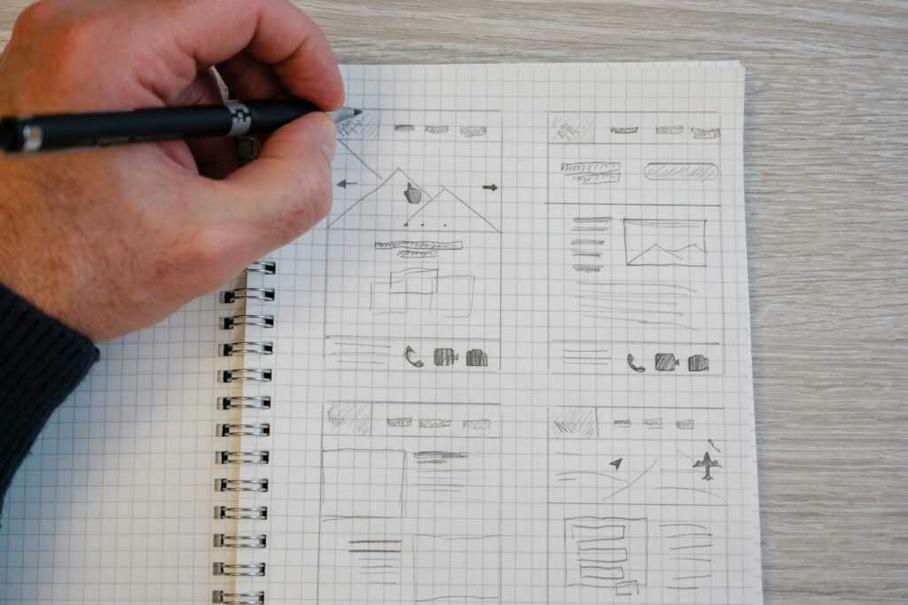
- Website Redesign: When I revamped a client’s website using a grid system, the visual coherence and user experience were drastically improved. By aligning images, text, and other elements to the grid, the website achieved a more organized layout, making it easier for visitors to navigate and find information quickly.
- Branding Collateral: In a recent branding project, utilizing a grid system for designing brochures, business cards, and other collateral materials ensured a consistent look and feel across all print assets. This consistency not only reinforced the brand identity but also created a professional and unified brand image.
- Mobile App Interface: By applying a grid system to the design of a mobile app interface, I was able to maintain consistency in element spacing, typography, and alignment. This meticulous approach resulted in a visually appealing and user-friendly interface that enhanced the overall user experience.
- Editorial Layout: Working on a magazine layout, I utilized a grid system to structure the placement of articles, images, and headlines. This systematic approach not only improved the readability of the content but also established a visual hierarchy that guided readers through the publication seamlessly.
- Social Media Graphics: When creating social media graphics for a marketing campaign, adhering to a grid system ensured that each post had a cohesive design style. Consistent use of grids for image placement, text alignment, and branding elements maintained a unified look across different platforms, reinforcing brand recognition.
By incorporating grid systems into various design projects, I’ve witnessed firsthand how they can elevate the quality of design outcomes by ensuring consistency, structure, and a visually pleasing layout. These real-world examples showcase the tangible benefits of using grid systems to improve design consistency across different mediums.


