When it comes to design, color plays a crucial role in capturing attention and conveying emotions. As a designer, I know the importance of creating eye-catching color palettes that resonate with your audience. The right combination of colors can make your designs stand out and leave a lasting impact on viewers.
In this article, I’ll share valuable insights on how to craft compelling color palettes that elevate your design projects to the next level. From understanding color theory to exploring trendy color schemes, I’ll guide you through the process of selecting harmonious hues that speak to your target audience. Get ready to unleash your creativity and transform your designs with captivating color choices.
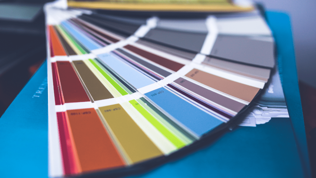
Understanding Color Theory for Design
Color theory is a fundamental aspect of design that influences how colors interact and impact the overall visual experience. As a designer, I rely on color theory to create harmonious and aesthetically pleasing color palettes that resonate with the audience. It’s essential to understand the basic principles of color theory to effectively communicate emotions, evoke moods, and establish visual hierarchy in designs.
When delving into color theory, it’s crucial to grasp the concepts of hue, saturation, and brightness. Hue refers to the color itself, such as red, blue, or yellow. Saturation determines the intensity or purity of a color, while brightness relates to how light or dark a color appears. By manipulating these elements, I can create dynamic color combinations that draw attention and convey specific messages in my designs.
One of the key principles of color theory is the color wheel, which provides a visual representation of how colors relate to each other. By understanding the relationships between primary colors (red, blue, yellow), secondary colors (green, orange, purple), and tertiary colors, I can leverage color harmonies to achieve balance and unity in my designs. Complementary colors, analogous colors, and triadic colors are commonly used color schemes that can help create visually appealing compositions.
Additionally, considering the psychological effects of colors is crucial when designing for a target audience. Different colors evoke varying emotions and perceptions, influencing how the audience interprets and engages with a design. For instance, warm colors like red and yellow are often associated with energy and passion, while cool colors like blue and green evoke calmness and serenity. By strategically selecting colors based on their psychological impact, I can enhance the overall effectiveness of my design solutions.
In essence, mastering color theory empowers me to make informed decisions when creating color palettes for my designs. By leveraging the principles of color harmony, understanding the psychology of colors, and experimenting with different color schemes, I can elevate the visual appeal of my projects and establish a strong connection with the intended audience.
- Choosing the Right Base Colors
Selecting the appropriate base colors is crucial in creating captivating color palettes for designs. It sets the foundation for the entire visual composition and significantly impacts the overall aesthetics. Here’s how to choose the right base colors:
- Exploring Color Psychology in Design
Understanding color psychology is essential when picking base colors for designs. Different colors evoke various emotions and perceptions in viewers. For instance, warm colors like red and yellow can convey energy and excitement, while cool colors like blue and green evoke calmness and serenity. By tapping into the psychology of colors, I can strategically select base colors that resonate with the intended emotions and messages of the design.
Creating Harmonious Color Schemes

In creating harmonious color schemes for designs, I focus on the interplay of colors to evoke specific emotions and convey intended messages effectively. By understanding color theory and harmonies, I ensure that the color palettes I choose resonate with the audience and leave a memorable impact. It’s essential to consider the psychological effects that colors have on emotions and perceptions to craft compelling designs.
When selecting base colors, I emphasize their pivotal role in establishing the visual foundation of a design. Base colors not only set the tone for the overall aesthetics but also influence how the audience engages with the design. By incorporating color psychology principles into the design process, I can strategically choose base colors that align with the desired emotional responses and convey the intended messages clearly.
Utilizing Tools and Resources for Color Palettes
Exploring tools and resources can significantly streamline the process of creating captivating color palettes for designs. There are various digital platforms and applications designed to assist designers in generating harmonious color schemes. These tools provide functionalities such as color wheel recommendations, color palette creation, and even color blindness simulations to ensure inclusivity in design choices.
One valuable tool that I frequently use is Adobe Color Wheel. It offers a range of color rules based on color theory principles, allowing me to quickly create cohesive color palettes that resonate with the intended emotions and messages of my designs. Additionally, websites like Coolors and Paletton offer similar features, enabling me to experiment with different color combinations and refine my palettes effortlessly.
Apart from dedicated color palette generators, design software like Adobe Creative Suite and Figma provide robust color customization options. These tools allow me to fine-tune colors, adjust hues, saturation, and brightness levels, ensuring precision in color selection for my design projects.
Moreover, online resources like Pinterest and Dribbble serve as excellent sources of inspiration for color palettes. By browsing through curated collections and design portfolios, I can gather ideas, trends, and color combinations that spark creativity and assist in developing unique and eye-catching color schemes for my designs.
Incorporating these tools and resources into my design workflow has not only enhanced the efficiency of creating color palettes but has also broadened my creative horizons, enabling me to explore diverse color options and elevate the visual impact of my designs.
Implementing Color Palettes in Your Designs
Exploring various tools and resources like Adobe Color Wheel, Coolors, or Paletton can significantly aid in implementing captivating color palettes effectively. Leveraging platforms such as Adobe Creative Suite, Figma, Pinterest, and Dribbble can enhance the efficiency and creativity in your design process while ensuring meticulous color selection.
When utilizing Adobe Color Wheel, I often rely on its color wheel recommendations to effortlessly create harmonious color schemes. Coolors, on the other hand, allows me to generate color palettes swiftly and conveniently. Paletton aids in customizing colors to align perfectly with the design vision, ensuring precise color selection for impactful results.
Platforms like Adobe Creative Suite offer a comprehensive set of tools for designing with diverse color options. Integrating Figma into the workflow can streamline the collaboration process with team members while incorporating visually appealing color palettes. Additionally, seeking inspiration from platforms like Pinterest and Dribbble can spark creativity and provide a wealth of design ideas to enhance your projects.