When it comes to creating visually striking designs, harnessing the power of contrast can be a game-changer. I’ll show you how to use this fundamental design principle to make your creations stand out and grab attention. By understanding how to effectively leverage contrast in your designs, you can elevate the impact of your work and create a memorable visual experience for your audience.
From bold color choices to striking typography pairings, contrast can breathe life into your designs and make them pop. In this article, I’ll guide you through practical tips and techniques on how to master the art of contrast in design. Whether you’re a seasoned designer looking to enhance your skills or a beginner eager to learn the ropes, understanding how to use contrast effectively can take your designs to the next level.
Importance of Contrast in Design
I believe contrast plays a pivotal role in design, elevating visual compositions and making them more compelling. By leveraging contrast effectively, designers can create eye-catching pieces that captivate viewers’ attention and leave a lasting impression. Whether it’s through the juxtaposition of light and dark hues, varied textures, or differing font styles, the strategic use of contrast enhances the overall aesthetic appeal of a design.
In my experience, contrast serves as a powerful tool to guide the viewer’s focus, emphasize key elements, and establish hierarchy within a layout. By incorporating sharp distinctions between various design elements, such as size, color, shape, and space, I can create a dynamic interplay that adds depth and dimension to the composition. This not only enhances the readability and visual interest of the design but also communicates information more effectively.
When exploring the realm of design, I’ve found that contrast can evoke emotions, set moods, and convey messages with clarity. The deliberate contrast between elements can evoke feelings of excitement, balance, harmony, or even tension, depending on the designer’s intent. By thoughtfully manipulating contrast, I can steer the viewer’s perception and create a memorable experience that resonates with them.
I’ve come to appreciate the fundamental role of contrast in design as a catalyst for elevating creativity, improving readability, and fostering emotional connections with the audience. By harnessing the power of contrast, designers can transform mundane layouts into visually striking masterpieces that demand attention and engagement.
Using Color Contrast Effectively
I’ll delve into how to effectively use color contrast in design to create visually impactful compositions.
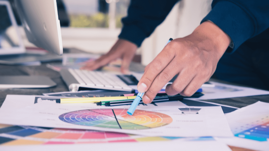
Choosing the Right Color Combinations
When selecting color combinations for your design, I always consider the color wheel. Using complementary colors, which are opposite each other on the color wheel, creates a high level of contrast. For example, pairing blue with orange or red with green can make elements stand out. Analogous colors, found next to each other on the color wheel, can also work well together, but they offer less contrast. Combining warm and cool colors adds visual interest and contrast to your designs.
Utilizing Light and Dark Contrast
In design, I highlight the importance of utilizing light and dark contrast to make elements pop. By incorporating a mix of light and dark shades, you can create depth and dimension in your designs. Using light text on a dark background or vice versa improves readability and draws attention to important information. Additionally, playing with shadows and highlights can add a three-dimensional effect, making your designs visually engaging. By mastering light and dark contrast, you can create visually dynamic compositions that capture the viewer’s eye.
Contrast in Typography
In typography, contrast plays a pivotal role in enhancing the readability and visual appeal of design elements. When it comes to text, the right amount of contrast between font styles, sizes, and weights can make a significant difference in how information is presented and perceived by the audience.
First, font styles are a critical aspect of typography contrast. Pairing different font styles, such as a bold header with a sleek body text, can create a visually engaging hierarchy that guides the reader’s attention effectively. By carefully selecting complementary font styles, I can ensure that the text not only stands out but also conveys the intended message with clarity.
Next, font sizes also contribute to contrast in typography. Varying the font sizes between headings, subheadings, and body text helps break down information into digestible chunks and emphasizes key points. By adjusting the font sizes strategically, I can create a sense of flow and structure within the text, making it easier for readers to navigate and comprehend the content.
Additionally, font weights add another layer of contrast to typography. Using a mix of light, regular, and bold weights can emphasize important information, create visual interest, and improve the overall visual hierarchy of the text. By skillfully combining different font weights, I can add depth and dimension to the design, making it more engaging and impactful for the audience.
By understanding the importance of contrast in typography and mastering the art of balancing font styles, sizes, and weights, I can create compelling designs that not only grab the viewer’s attention but also effectively communicate the intended message. Typography contrast is a powerful tool that, when utilized effectively, can transform ordinary text into visually striking and highly impactful design elements.
Applying Contrast in Layout and Composition
In layout and composition, contrast plays a pivotal role in creating visually engaging designs that captivate viewers and convey messages effectively. By strategically incorporating contrast elements such as color, typography, size, shape, and space, designers can elevate the aesthetics of their compositions while ensuring clear communication.
- Utilizing Contrast in Color:
When designing layouts, contrasting colors can draw attention to specific elements, emphasize important information, and create visual hierarchy. By pairing colors with varying levels of saturation, brightness, or hue, I can create dynamic and eye-catching designs that stand out. - Leveraging Contrast in Typography:
Typography is a key component of layout design, and contrast in font styles, sizes, and weights can significantly impact readability and visual appeal. By juxtaposing different typographic elements, such as pairing a bold headline with a simple body text, I can create a harmonious yet striking composition. - Employing Contrast in Size, Shape, and Space:
Experimenting with variations in size, shape, and space within a layout can add depth and visual interest. By juxtaposing large and small elements or playing with negative space, I can create a sense of balance and harmony in my designs.
By consciously applying contrast in layout and composition, I can elevate the impact of my designs, guiding viewers’ focus, eliciting emotions, and effectively communicating messages. The careful balance of contrasting elements helps transform ordinary compositions into visually striking and impactful design pieces that leave a lasting impression.