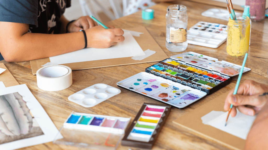
Understanding Why Blending Matters
Blending isn’t just about making things look smooth. Done right, it’s how you sculpt light into form, shift flat shapes into volume, and guide the viewer’s eye without shouting. Good blending carves out muscles, curves planes, and sets atmosphere. Whether it’s skin, metal, or fog it’s the bridge between light and structure.
This is where the line between amateur and pro gets drawn. Beginners often slap colors together and smudge until things go gray. Pros? They blend with purpose. Every edge, every gradient, every transition is deliberate. They read the light, follow the flow of the form, and leave room for texture.
That’s the danger, too. Over blending flattens everything. It kills energy. Colors get muddy, edges vanish, and suddenly the piece feels lifeless. Common traps? Using just the smudge tool. Or sampling mid tones too often until everything turns beige.
Solid blending isn’t about making everything smooth. It’s about knowing when to go soft, where to hold hard edges, and how to move color in a way that respects light. It’s muscle memory plus restraint. And it’s non negotiable if you’re aiming for pro level digital work.
Technique 1: Soft Brush Transitions
Blending with soft brushes is a foundational skill that every digital artist should master. When used correctly, soft transitions can create a sense of atmosphere, depth, and believable lighting that gives artwork life and dimension.
When to Use Soft Edges
Soft edges are especially effective in these situations:
Moody Atmospheres: To suggest fog, background blur, or soft lighting conditions.
Gradual Changes in Light: Especially when blending from light to shadow over curved surfaces like cheeks, clouds, or fabric folds.
Creating Depth: Softer edges help push elements into the background while maintaining form.
Knowing when to soften your edges and when to keep them crisp is key to controlling the viewer’s focus and maintaining visual clarity.
Pressure Sensitivity Matters
Your stylus pressure settings can dramatically affect how smooth and natural your blends appear. A few simple tweaks make a big difference:
Pressure for Opacity: Allows gradual buildup of tone and color.
Pressure for Size: Helps taper strokes for smoother transitions.
Custom Mapping: Adjust settings in your digital painting software to respond well to light pressure, giving you more control with less effort.
Increasing your sensitivity awareness prevents overworking areas and adds subtlety to your rendering.
Layering Tones and Colors
Smooth gradients aren’t just about dragging a brush from one color to another. They’re achieved through thoughtful layering:
Build Gradients in Passes: Start with broad tone transitions, then refine with smaller, controlled brushwork.
Blend Colors, Not Just Values: Introduce subtle shifts in hue (cool to warm) to make transitions feel more alive.
Use Opacity & Flow Settings: Lower settings enable the buildup of translucent color, adding richness and visual harmony.
Mastering these micro techniques will lead to softer, more confident blends while preserving underlying structure and form.
Technique 2: Hard Edge Blending for Structure
Blending gets a soft rep, but not everything should melt into the background. Hard edges, when placed right, bring clarity and shape to your work. They help define planes, direct focus, and build structure. Think cheekbones, jawlines, fabric folds stuff that needs to pop instead of fade.
Here’s where technique comes in. If you’re using opacity, you’re building with control gradual tone shifts, layer by layer. It’s solid for blocking in major shapes. Flow, on the other hand, gives you smoother transitions but requires a steady hand. It’s easy to go muddy if you’re not careful.
Know when to stop blending. Not every edge has to vanish. Preserve them where form turns sharply or light breaks suddenly. That contrast is what sells realism and impact. The trick is balance soft enough to be believable, hard enough to hold structure. No blur for the sake of blur.
Technique 3: Smudge Tool Use It, Don’t Abuse It

The smudge tool can be your best friend or the reason your art looks like a greasy fingerprint. Used right, it helps soften transitions and smooth edges without losing structure. It’s especially useful for blending subtle gradients between tones, like skin or fogged glass. But the trick is to go easy. Think quick swipes, not paint stirring.
Customizing your smudge brush is where things actually start working. Ditch the default. Tweak the brush shape, scatter, and texture settings. Add just a touch of jitter or texture maps to break up the smoothed area and maintain a natural feel. The goal isn’t blur it’s control.
But here’s the hard truth: if you lean on smudge alone, your work flattens fast. Smudging everything washes out form, light, and intent. The magic happens when it supports other techniques like painting in some hard edges first, then using smudge to taper shadows or blend transitions. Use it more like polish, not as the whole process.
Bottom line: smudge is great when it’s a supporting actor, not the star of the show.
Technique 4: Color Picking Like a Pro
The eyedropper tool can be your best friend or it can quietly ruin your painting. It’s great for sampling subtle tones and keeping skin tones or lighting clean and consistent. But lean on it too much, and you risk flattening your palette. Colors sampled directly from your canvas often miss the vibrancy or warmth needed to keep an image alive.
Instead of just grabbing values and matching brightness, focus on mixing in intentional hue shifts. Cool shadows don’t have to be just darker skin tone they can shift toward blues or purples. Highlights might push toward peach, gold, or even green depending on your light source. This keeps your work feeling organic, not robotic.
The biggest mistake? Falling into the grayscale trap where every blend becomes a neutral mush. Strong blending doesn’t mean blending everything into a gray soup. It’s about transition. Keep your mids rich with hue, your edges thoughtful, and your colors breathing. Eyedropper tools help, but your judgment is still the real MVP.
Technique 5: Layer Modes for Seamless Blends
Layer modes are a powerful, often underused blending tool in digital painting. When used intentionally, modes like Overlay, Multiply, and Soft Light can add depth, color, and realism without the need to over blend manually.
Key Layer Modes to Master
Multiply: Darkens values without turning them to black. Great for creating realistic shadows and shaping form.
Overlay: Enhances contrast and saturation. Ideal for adding glow, warmth, or punch to specific areas.
Soft Light: A more subtle cousin of Overlay. It enriches colors without overpowering base tones, perfect for delicate skin tones and gradients.
Use Cases That Make a Difference
Understanding when and where to apply these blending modes elevates your entire workflow:
Skin Tones: Use Soft Light or Overlay layers with warm or cool tints to create realistic undertones and lighting effects on skin.
Lighting Effects: Combine Multiply for cast shadows and Soft Light for gentle highlights to build dynamic lighting.
Metallic Surfaces: Overlay layers can add specular highlights, while Multiply gives form and weight to reflective surfaces.
Keeping Control: Masks and Adjustments
To avoid overworking your painting or reducing flexibility, consider these control tactics:
Clipping Masks: Let you apply layer mode effects to specific layers or shapes without affecting the entire canvas. Great for isolating lighting or color shifts.
Adjustment Layers: Use levels, hue/saturation, or curves on top of your effect layers to fine tune the intensity without painting directly.
By strategically using layer modes alongside your brushwork, you’ll create more believable blends while maintaining flexibility and control in your file.
Bonus: Mastering Brushwork as a Foundation
Blending won’t save sloppy groundwork. If your strokes are shaky, your form is vague, or your lighting makes no sense, smooth transitions won’t fix it they’ll just smear the problem around. Before you obsess over perfect gradients or subtle shifts in tone, your base brushwork needs to be solid.
Think of every good blend as a layer sitting on top of structure. If that structure is weak, no amount of color massage is going to elevate the piece. Work on stroke confidence, shape clarity, and value grouping. Nail those, and blending becomes a polish, not a crutch.
Need a refresher? Get back to the basics here: digital brushwork tips.
Final Quick Tips
Limit your palette. Having fewer colors forces you to wring more out of each one better value control, smarter color shifts, and cleaner blends. It’s not glamorous, but it sharpens your instincts fast.
Photo studies help too. Don’t copy just for likeness look at how light wraps, what edges fall off, and where tones transition naturally. Zoom in. Break it down. Then try replicating it without color picking. That’s where growth happens.
Lastly, save your process files. Not just finished pieces, but the messy in betweens. They’re receipts for your progress, and roadmaps for what actually worked. Mistakes? Keep those too. They teach more than polished outcomes ever will.