What White Space Really Is (And Isn’t)
Understanding white space is essential to leveling up your design skills, but it’s often misunderstood. Let’s clear that up and look at how intentional whitespace can transform your layouts from good to premium.
White Space Is Not “Wasted” Space
One of the most common myths in design is that white space equals empty or unused space. In reality, white space is an active design tool used to:
Improve user focus
Clarify layout structure
Enhance overall visual balance
Think of it as a design element in its own right not absence, but intention.
The Purposeful Power of White Space
Instead of filling every inch of your canvas, white space gives your content room to breathe. It improves the user experience by:
Creating clarity around key information
Making designs less overwhelming
Adding a sense of sophistication and trust
In high performing designs, white space helps direct the eye and gives visual hierarchy room to work.
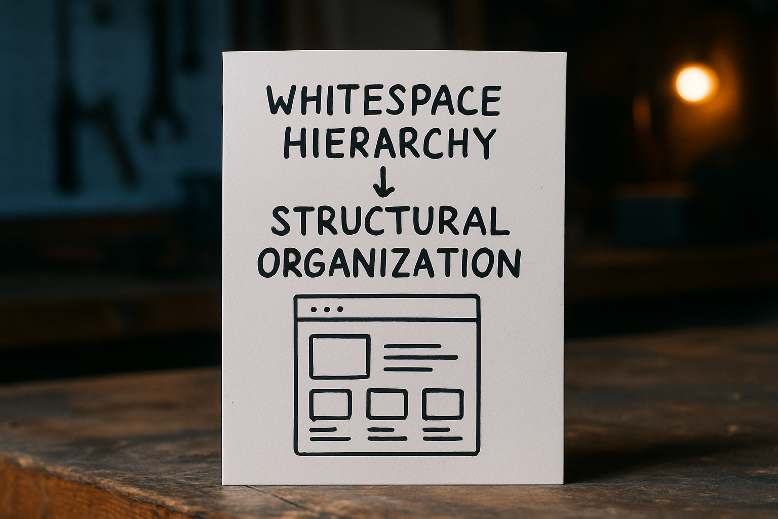
Two Types of White Space to Know
White space acts across two levels and mastering both is key:
Macro white space: The space between large design elements (e.g., sections, columns, images). Think page margins or the gaps between article cards.
Micro white space: The spacing between smaller elements like lines of text, letters, buttons, and icons.
Both are critical. Macro space guides flow. Micro space fine tunes readability and detail.
Why the Best Designers Prioritize White Space
Designers who skillfully use white space don’t do less they make smarter choices. They rely on intentional spacing to:
Build intuitive and elegant layouts
Highlight the most important content
Simplify navigation and readability across devices
In an age of visual noise, less truly stands out. Mastering white space is not just about aesthetics it signals confidence, clarity, and control.
The Role White Space Plays in Better Design
White space isn’t wasted space it’s what makes everything else work.
Designs overloaded with text and graphics become visual noise. White space cuts through that, making layouts easier to read and faster to scan. It gives breathing room to text, clarifies structure, and helps users find what matters without thinking too hard.
When used intentionally, white space directs focus. It says: focus here, this matters. That’s the kind of clarity that keeps people on your page instead of bouncing off.
It also brings a sharp, clean feel. Think modern, premium, focused. It’s the reason top tier brands lean into simplicity. Minimalism isn’t just a style it’s a strategy.
By giving content space to stand on its own, your design feels confident, refined, and purposeful. That’s not fluff. That’s function.
How White Space Supports Visual Hierarchy
White space isn’t just there for looks it’s the scaffolding your design rests on. Strategic spacing forces the eye to stop and pay attention. It gives headlines power, lets CTAs punch through the noise, and separates visuals so they don’t clash for attention.
Think of it like a breath between sentences. It creates rhythm, makes content easier to scan, and builds a flow that feels natural not forced. By spacing elements with intent, designers guide the viewer without shouting.
The best layouts use spacing to prioritize, not decorate. Want to see it in action? Check out Visual hierarchy explained. It shows how alignment, spacing, and structure all work together to control what matters most.
Common Mistakes When Using White Space
Let’s get one thing out of the way: white space isn’t wasted space. A lot of designers especially newer ones treat blank areas like failure zones. So they cram in buttons, banners, text blocks, anything to avoid what feels like a void. In trying to fill every inch, they kill the flow.
Another misstep? Ignoring how layouts behave on mobile. What looks balanced on a desktop can turn into a clutter bomb on smaller screens. Overstuffed designs become scroll heavy and confusing fast. White space helps clear the way, especially when you need quick comprehension under thumb.
Then there’s the symmetry trap. Clean doesn’t mean mirrored. Obsessing over balance can lead to unusable layouts that “look” right but don’t guide users through content in any smart or helpful way. Great design isn’t about perfect spacing it’s about intentional spacing that enhances what matters.
Avoid these mistakes long enough and you’ll start to see white space as a power tool, not a gap to patch.
Practical Tips to Use White Space Like a Pro
Start by trimming the fat. A clean design begins with a content audit what’s truly necessary? Strip out anything that doesn’t serve a clear purpose. This forces clarity in both visuals and messaging.
Once you know what matters, layout becomes critical. A simple grid system gives your design structure. Stick to consistent margins and spacing between elements. It’s not about making everything symmetrical it’s about building rhythm.
Don’t shy away from empty areas. Big margins and wide spacing may feel unsettling at first, but they give your work breathing room. Especially on mobile, space becomes function. Clutter shrinks legibility and tanks interaction. Clean space invites action.
Finally, test. Your spacing decisions should work for real users, not just your personal preference. Try pushing margins wider or spacing tighter, then watch how users respond. Iterate ruthlessly. Great design is less about decoration, more about control.
Why Less Really Can Be More
White space is often misunderstood as merely a decorative element, when in reality, it plays a critical functional role in design. It’s not just about what you remove it’s about what you emphasize.
Function Over Decoration
White space isn’t wasted space it’s strategic. Properly applied, it amplifies the impact of your content, drawing attention where it’s needed and reducing friction in user experience.
Improves readability and user comfort
Creates visual breathing room around important elements
Encourages intentional browsing, not visual overload
A Signature of Strong Brands
Top brands around the world harness white space intentionally. It’s a visual signal that conveys clarity, quality, and confidence.
Apple uses white space to emphasize product minimalism and innovation
Google balances content with space, reinforcing user centered design
Airbnb and Dropbox use white space to focus attention and build trust
The Multiplier Effect
When you master white space, every other design decision benefits:
Typography feels more refined and easier to scan
Visual hierarchy becomes more intuitive
Calls to action stand out without shouting
Keep Exploring
Want to go deeper into how layout and spacing affect design perception? Don’t miss this guide:
Visual hierarchy explained