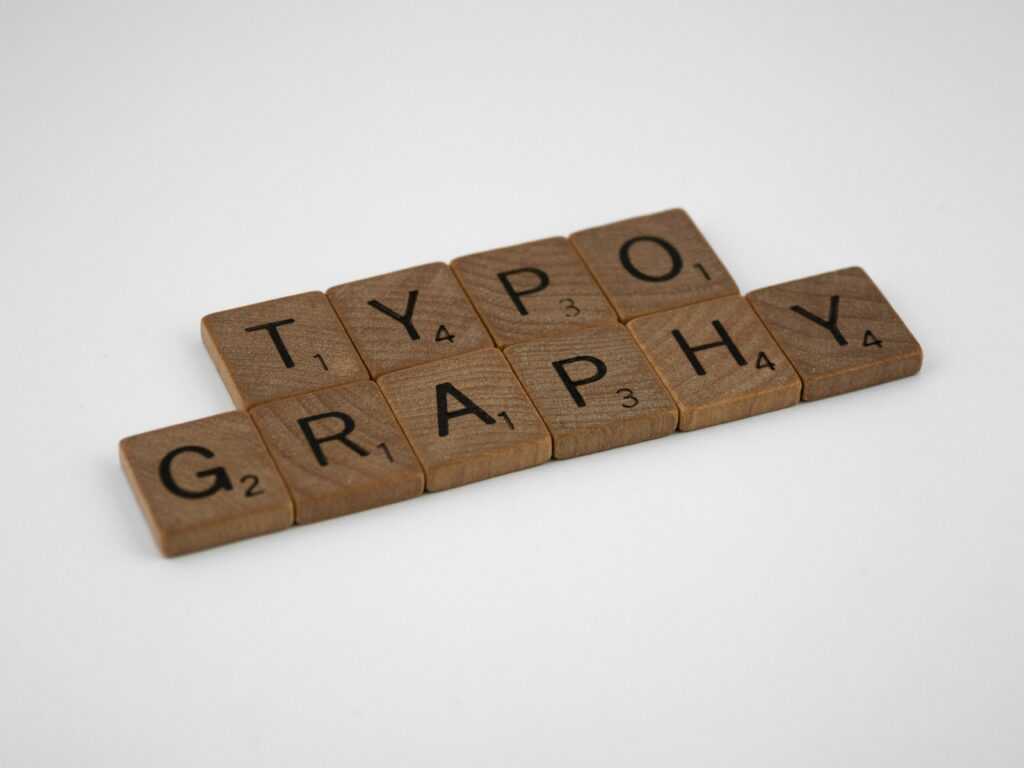
Understand the Power of Typography
Typography isn’t just a design detail it’s a communicator in its own right. Choosing a typeface means choosing a tone, a voice, and even an emotion. Great typography guides the viewer before a single word is spoken aloud or a message fully read.
More Than Just Picking a Font
Typography goes beyond aesthetics. It plays a role in how your message is received, interpreted, and remembered. The right font can:
Establish credibility and trust
Set the emotional tone of a message
Reinforce the purpose of a design
Choosing a font arbitrarily can result in confusion or disconnect. In contrast, thoughtful type decisions help build alignment between message, brand, and audience.
Design That Speaks Emotionally
Typographic choices evoke emotional responses just like color or imagery. Consider:
A bold, modern sans serif conveys confidence and clarity
A soft script font feels more personal or romantic
Monospaced fonts suggest tech savviness or simplicity
Even subtle typographic tweaks like light vs. bold weights, tighter spacing, or swapping between uppercase and title case can shift how a message is perceived.
Same Message, Different Feel
Here’s a quick look at how typography transforms tone:
Message: “Now Available”
In a clean, minimalist sans serif (e.g., Helvetica Neue) → feels modern and professional
In a serif with thin strokes (e.g., Didot) → feels elegant and premium
In a bold display font (e.g., Impact) → feels urgent and headline grabbing
Ultimately, typography sets the foundation for your design’s entire mood. Choose wisely, and type becomes one of your most powerful communication tools.
Choose Fonts with Purpose
Before you scroll through a font list for half an hour, stop. Ask yourself: what is this design supposed to do? Are you catching attention, building trust, or delivering info fast? The goal determines the feel. And the feel starts with type.
Once you’ve got clarity, it’s time to pick your players. Serif fonts those with little finishing strokes carry tradition, elegance, and authority. Think newspapers, law firms, luxury branding. Sans serifs are cleaner and more modern. They’re lean, legible, and digital native. Perfect for apps, startups, and anything that needs to feel fresh.
Then there’s the wild stuff: display and script fonts. These aren’t for long reads. They’re for impact. A bold display font can anchor a poster or headline, while a script font adds flair or personality if you’re careful. They make statements, but too much and things go cheesy fast.
Use fonts like tools. Know what job they’re doing. And don’t let looks alone steer the work.
Master the Art of Font Pairing
Font pairing is more than an aesthetic decision it’s a way to guide your viewer’s eye, build contrast, and reinforce your design’s voice. The first rule of thumb: contrast is non negotiable. You want difference in weight, size, or style, not fonts that just look “slightly different.” Pair a bold serif headline with a clean sans serif body, or combine a thin modern type with something strong and structured. You’ll get visual texture and hierarchy without clutter.
Avoid mixing fonts from the same classification. Two slab serifs or two near identical geometric sans serif fonts? Usually a bad call. They tend to clash or blend too much, making the design feel off balance.
Also, keep it simple. Two fonts is ideal. Three if you’re clever. More than that, and you’re into circus territory. Remember: cohesion beats chaos.
That said, it’s okay to break the rules but only once you actually know them. Understanding what works lets you take calculated risks that pay off instead of random guesses that don’t.
Still unsure what pairs well? Start with these basics or check out this deeper font pairing guide.
Nail Hierarchy and Spacing
Clear visual hierarchy is one of the most powerful tools in a designer’s arsenal. It guides the viewer’s eye across a layout and ensures your message is communicated in the right order of importance.
Lead the Eye with Purpose
Good typography doesn’t just look clean it behaves with purpose. By controlling the weight, size, and positioning of each text element, you help the viewer understand where to start and what to pay attention to.
Headlines should immediately grab attention and establish tone.
Subheads provide structure and support the headline with more detail.
Body text delivers the core message and should feel easy to scan and digest.
Role Based Typography
Each type of text must play its part:
Headlines: Bold, clear, and decisively different from body copy.
Subheads: Slightly smaller than headlines but still prominent.
Body Text: Highly legible with consistent rhythm for easier reading.
Fine Tune for Impact
Small tweaks make big differences in how text feels and flows:
Line Height (Leading): Controls vertical spacing. Too tight makes reading difficult; too loose disconnects the content.
Letter Spacing (Tracking): Adjust spacing between characters for mood and readability especially in all caps or large titles.
Alignment: Left aligned text is most readable. Use center or justified alignment strategically and sparingly.
Treat each design layout as a visual journey. Thoughtful hierarchy and spacing don’t just elevate aesthetics they reinforce the story you’re telling with every word.
Customize Type Like a Pro
Custom typography isn’t just for big budget agencies it’s a skill solo designers can master too. First up: kerning. Most fonts come with solid spacing baked in, but when letter pairs feel off like a wide gap between ‘A’ and ‘V’ it’s time to step in manually. Tightening or loosening the space between characters, especially in headers or logos, turns decent type into polished work.
Next level: converting type to outlines. Once your text is final, turning it into vector shapes lets you adjust every curve and anchor. Maybe that “R” needs a longer leg, or the tail on a “Q” feels heavy. Subtle refinements here separate your design from every other piece using the same font straight out of the box.
These micro adjustments fine tuning spacing, angles, or proportions might seem small, but they show craft. Type is a tool, but once you start customizing it, it becomes part of your signature.
Keep Readability Front and Center
Beautiful typography means nothing if no one can read it. Start with size. For screens, stay at 16px or above for body text anything smaller becomes a squint fest. On mobile, tighter layouts make 14 16px the minimum. Print gives you more flexibility, but nothing under 10pt for body copy unless you’re designing a legal disclaimer.
Next, contrast. Your text shouldn’t blend into the background. Light text on light backgrounds or dark on dark just don’t. High contrast boosts not only readability but accessibility too. Font thickness also matters. Thin fonts might look stylish, but if they disappear on certain screens or against busy images, they’re useless.
Decorative or experimental typefaces? Go ahead but only if they add value. If they confuse the message or slow down the reader, cut them loose. Fancy should never come at the cost of clarity.
Use Type to Build Brand Identity
Typography does more than just deliver messages it visually communicates who you are. Every font, spacing choice, and letterform plays a role in shaping your brand perception.
Why Consistency Matters
Maintaining consistency in your typography ensures that your audience immediately recognizes your brand, no matter where they encounter it.
Use the same set of fonts across all brand materials
Establish typographic rules for headings, body text, and accents
Stay consistent with alignment, spacing, and sizing conventions
Reflect Your Brand’s Voice and Values
The style of type you choose can mirror your personality:
Professional and serious? Consider clean serifs or modern sans serifs.
Playful or adventurous? Think bold display fonts or hand written styles.
Luxury or elegance? Look to thin, high contrast typefaces with subtle flair.
Every typeface tells a story make sure yours aligns with the emotion your brand wants to evoke.
Stay on Theme Across All Touchpoints
Your typography shouldn’t change from a website to a brochure to an app. Brand cohesion comes alive when design decisions scale seamlessly.
Use your brand typefaces across print and digital formats
Adapt font weights and spacing to fit medium constraints, without changing the overall style
Keep tone and mood consistent even when writing for different platforms
Strong typography isn’t just visual it’s foundational to a recognizable, trustworthy brand experience.
Recap with Actionable Steps
Start by auditing your current designs. Look at what’s working and what’s not. Are your headings consistent? Is your body text easy to read? Does each design feel intentional? This isn’t just about catching mistakes; it’s about seeing patterns and tightening up your visual system.
Next, create a typography style guide that’s actually usable. Define your go to fonts, sizes, line heights, and spacing. Make decisions once, apply them everywhere. Whether you’re designing a promo banner or a pitch deck, good type decisions should feel automatic, not a guessing game.
And anytime you feel stuck or want to try new combinations, revisit this solid font pairing guide. It’s a practical tool not fluff. Keep it bookmarked. Typography isn’t one and done. It’s a system, and systems get stronger with use.